Branding & Digital Design
undefined 2025

Antonin Artaud – Book series
The three-book series delves into the world of Antonin Artaud, a prominent French actor and playwright known for his impactful plays and thought-provoking philosophies.
Each book mirrors a distinct phase of Artaud's life journey: his influential play The Cenci, his confinement in an asylum, and his post-institutionalization period. The design of these books captures Artaud's psyche and the surreality of his works.
Year
2014
Services
Book Design, Book Design, Art Direction
Industry
Arts & Culture, Theatre


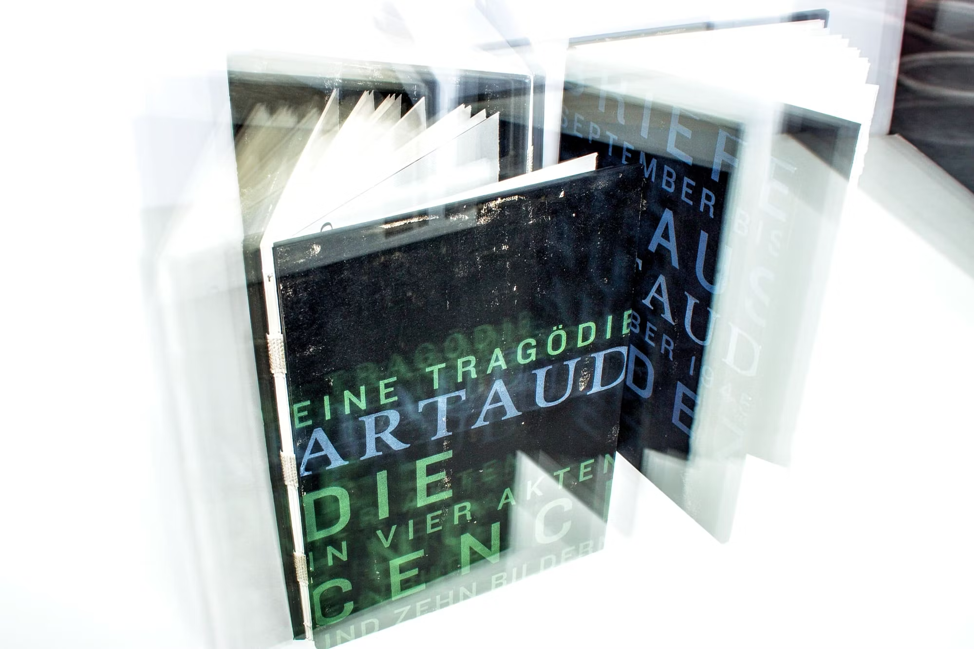
The design seeks to immerse readers, highlighting the contrasts within Artaud's world. These volumes mirror his essence, blending sturdy exteriors with delicate interiors. The cover is screen-printed Finnish machine wood cardboard, boasting a rugged, substantial feel against the softer, open-bound inner pages.
All the books in the series employ textured, woodfree and unbleached high-volume paper. The tactile sensation of the hand-torn page edges heightens the readers' experience, engaging a deeper sensory level, much like the theory behind the Theatre of Cruelty.


PART 1/3: THE CENCI
In The Cenci, Artaud navigates the tragic tale of Italian nobleman Francesco Cenci and his family, delving into themes of incest, parricide, and cruelty.

The cover and image of Beatrice Cenci features a sickly green hue, conveying feelings of envy, greed, and toxicity.


01 /03

The design distinctly portrays Francesco Cenci's dialogues in Knockout font to emphasise power and domination, while family exchanges employ the humanistic typeface DTL Documenta.
Narrow side margins move the layout closer to the hand-torn edges, indicating the family's perpetual fear of tyranny and control, intensifying the narrative's unsettling essence.

PART 2/3: LETTERS FROM RODEZ
Letters from Rodez encapsulates Artaud's correspondence during his confinement at the psychiatric clinic in Rodez. Artaud wrote this collection while undergoing electroshock and art therapy for schizophrenia treatment.

The book's design choices, symbolising this period, include a blue book cover and a clinic photograph. Blue signifies communication, trust, and loyalty, mirroring the content's nature.


01 /04
The sizable margins and condensed Knockout font heighten the feeling of confinement.
The ample space around the text emulates a sense of restriction, while the font's tight, compressed style intensifies the feeling of being constrained within the book's boundaries.

PART 3/3: THEATRE OF CRUELTY
This book continues Antonin Artaud's journey after his release from the asylum in Rodez. It is a collection of theatrical theory, letters, poetry, and his controversial radio play from 1947. The Theatre of Cruelty method aims to intensify the impact on the audience through violent and vivid experiences.

The design choices echo this method by using a purple hue on the book cover and images, symbolising mystery and enigma.


01 /04
The cryptic content within the book, combined with deliberate manipulations in word spaces, creates a sense of lucid dissociation.
Wide margins and the Knockout font emphasise the unsettling essence portrayed throughout.


Recognitions & In Press
related projects

